As it turns out, the most popular pages on this site are some posts I created a year or two back regarding the Peloton screen and what all the numbers on it mean. I thought it might be of interest to people if I created the same for Zwift, because there are many more overlays on the Zwift display, and they are also contextual — that is, they change depending on what you are doing in the game at the time.
Because this topic is so vast, I am going to have to build my post(s) out in stages, starting with the most common overlays and working my way toward the less common variations, including workout and racing. I’m committed to doing an update each week, but it may, in fact, be several weeks before I’m able to capture it all. Ever since I had the idea to document it all I’ve been mindful of how much data is actually on the screen and how often it changes, and the job gets bigger every time I look at it!
The top-center display: the basics
I might as well get into it, though, so here goes!
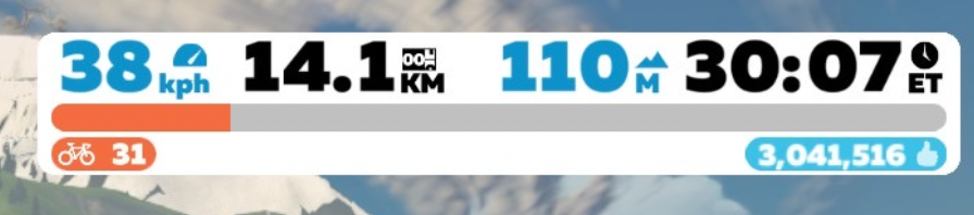
This is the display that is top-center of the screen, in its most basic form. If you are doing a workout or in a race you may see additional data (I’ll document later), but if you’re just riding around then this is your basic display, and contains all of the most basic information about you and your ride. The data shown above is always present in every mode of the game.
The blue number on the left (38kph in this case) is your speed. Whether it’s displayed in mph or kph depends on whether you’ve selected “imperial” or “metric” units in the preferences. (It is well known that Zwift points accumulate approximately 7% faster under the metric scheme, so that’s what most people use, even in the USA).
The black number in the center (14.1km) is the odometer, the total distance of the ride up to that point. It starts at zero and counts up as you ride.
The blue number to the right of the odometer (which reads 110m in the image above) is the amount of vertical climb traveled so far in the ride. This is displayed either in feet or in meters, depending on your choice in preferences.
The far right, black number in the white box (30:07) is the elapsed time of the ride. It is labeled “ET” for elapsed time.
Below this top row of numbers is an orange progress bar. This gives you a graphical representation of how far you have to go to get to the next level in Zwift. Generally (but not always) the distance between each level in Zwift is greater than the distance for the previous level, so one tends to advance more quickly early on and progressively more points are needed to advance as you progress through the levels.
Just below and left-justified with the orange progress bar is a bike icon and your current level (31 in this example). The blue number that is below and right justified with the orange progress bar is the number of “drops” you have accumulated. In this example, 3,041,516 drops are shown.
Briefly, drops are a sort of currency in Zwift, and you can spend them on new bike frames and wheels (other bike frames and wheels are awarded to you for certain accomplishments, such as completing the California, Italy, or Everest Challenges).
You can see to the right of the drops number a thumbs-up icon. That icon is only present for a few seconds after receiving a “ride-on” from another player. For those few seconds, you accrue drops at a slightly accelerated rate. There is also a mountain icon that you might see, which indicates that you are accruing drops faster due to riding on a relatively steep incline. And yes, you can be both riding an incline and receiving a ride-on at the same time. In that, case you will see the icons alternate for as long as they are in effect.
So, that’s the most basic display, and still it took several paragraphs! Let’s get into some of the contextual displays:
On a route
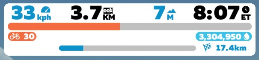
Here’s a display that is much like the basic Zwift display, but with some additional information at the bottom. You can see a progress bar and a checkered flag with a distance number (17.4km). This is how the main white box will look if you are riding a fixed-distance route, such as in a meet-up or event. The progress bar shows progress along the route (looks to be about 20% in this example) and the blue distance number is the distance remaining in the route. Since it’s the distance remaining, you’ll see it decrease as you ride. Ultimately, the blue bar will become completely filled in and the blue distance number will diminish to 0, and that will be the end of the fixed-distance route.
Basic display during timed segments
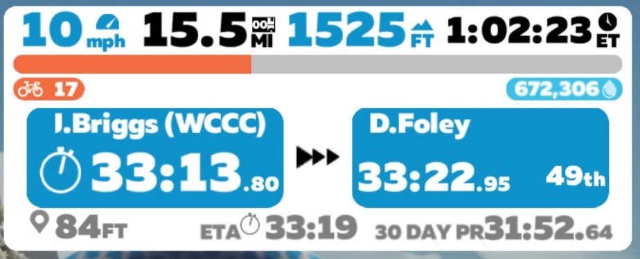
When you are approaching the end of a timed segment, the display changes to show more information about your performance during the timed segment. The top of the display is the same as usual, showing (l-r) speed (10mph), distance covered so far (15.5mi), height climbed so far (1525′), elapsed time (1 hour, 2 min, 23 seconds), a progress bar showing progress to the next level, the current level (17) and the current number of drops (672,306).
Next you’ll see two blue boxes. The left box is your own elapsed time through the timed segment (33:13.80 in this case). The right box is the time it took another rider to complete the segment. In the illustration, it shows me that D.Foley completed the segment in 33:22.95 and took 49th place for the segment. This tells me that I have approximately nine seconds to finish the segment to take 49th place from D.Foley. If I cannot complete the segment in less time than Foley, the right-hand blue box will show me the time of the 50th place finisher, and I can try to beat that. The right-hand box will cycle through all the finishers until I, myself, finish.
The bottom line on this display, from left to right, is the distance left to go in the segment (84 feet), an estimated time to complete the segment (33:19 – note that this is the estimated total time, not the estimated time remaining), and my own 30-day PR for the segment.
So, if everything went according to plan on this ride, I would have finished the segment six seconds after this screen shot was taken, finished in 49th place, and pushed D.Foley to the 50th spot. Of course, it ain’t over until it’s over, so you need to keep pushing until the finish line!
UPDATE: I had planned to make this a series of posts describing all of the overlays of the Zwift screen, but as I started gathering information about the next screen I was working on, I found that there already was a lot of good documentation available, on sites like ZwiftInsider and others for that reason, I think I will not continue to build out this set of posts. I might change my mind if Zwift adds new features without any good documentation, but for now I do not want to duplicate work that’s already been done.
Very helpful. One question: I often see a small vertical white bar in the blue “fixed distance route” progress bar. Any idea what it relates to? Thanks
You might be referring to the demarcation between the “rollout” and the route itself. Sometimes, there’s a little segment that you ride before the loop starts (and in a few cases it’s nearly as long as the route itself!). That section is separated from the “main” route by a narrow white line.